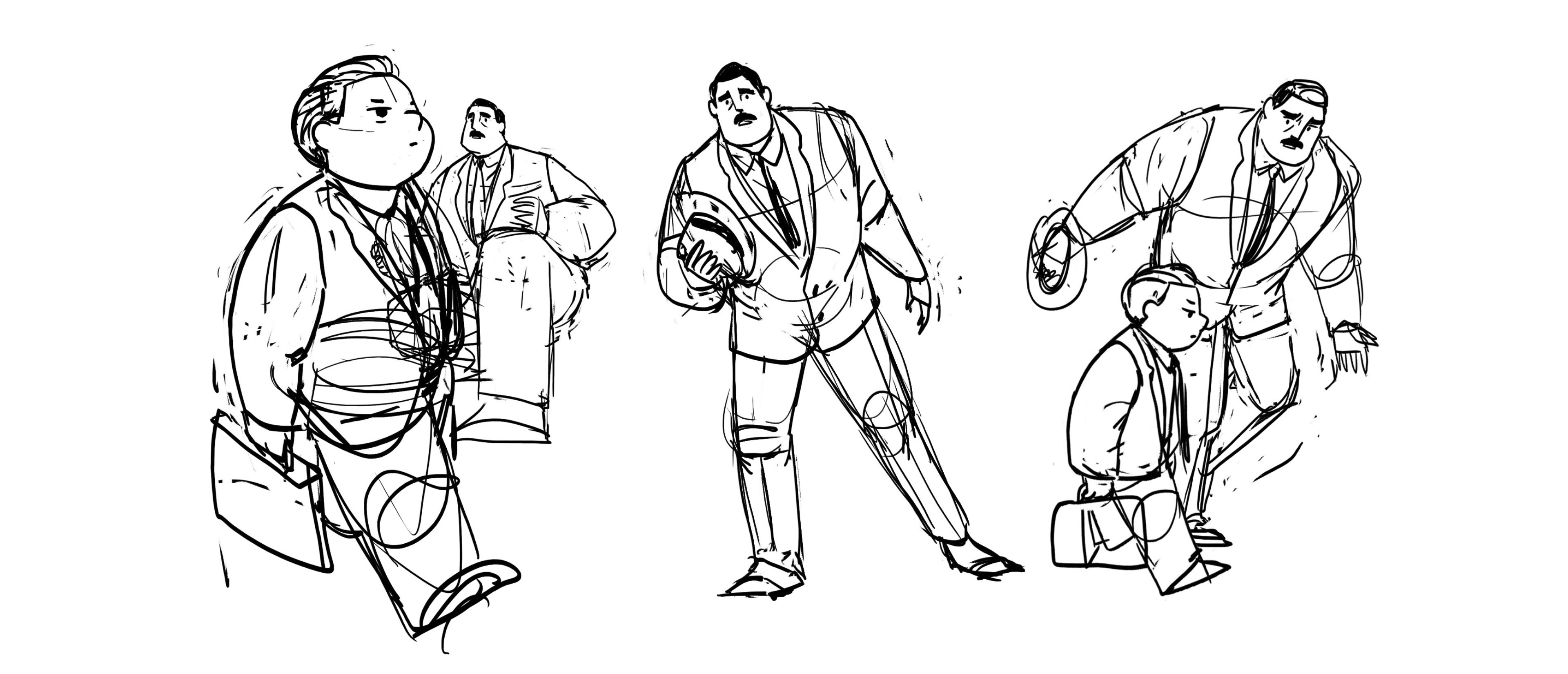
Establishing the story beats helped me dig deeper into how my characters would look and feel, both visually and narratively. While "Character Development" and "Story Development" exist as separate posts in this blog, the two processes were inseparable from each other — the development of one continuously informing the other. Coming up with a character intro as below helped me narrow down the key features of my characters:
N I C K
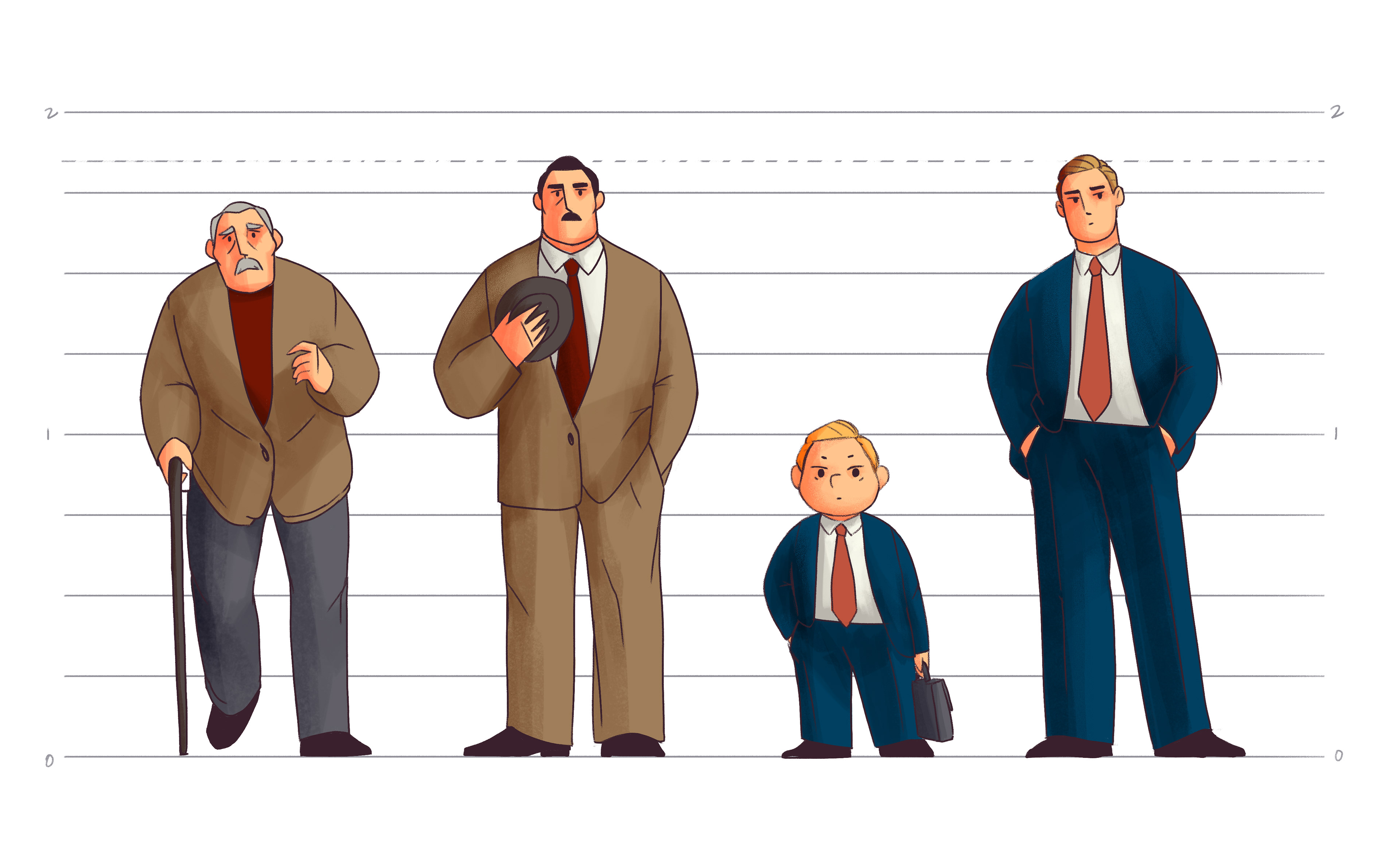
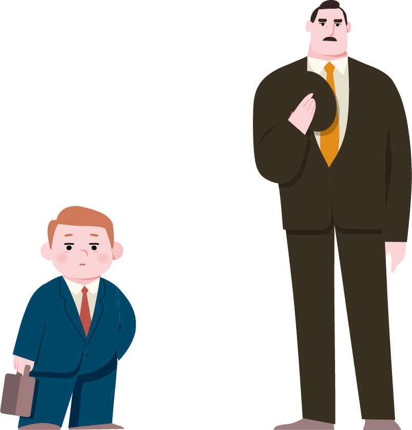
When we meet Nick, he is an eight-year-old dressed prim and proper in a sleek suit and a flawless coif, living a picture-perfect grownup life. However, his composure is thrown out the window the moment he encounters Frank whom he clearly has a complicated history with.

F R A N K
When we meet Frank, he appears to be the definition of a traditional alpha male. His expensive suit perfectly outlines his towering physique and the confidence that fills it; his pronounced jaw and his slightly squinted, prominent brows that bury his deep-set dark eyes in the shadow demand the kind of attention that you would give only to corporate executives. And yet, in his interactions with Nick, we see him nothing but grovel for the mercy of the eight-year-old.
EARLY DESIGN
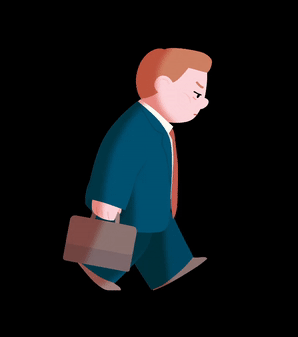
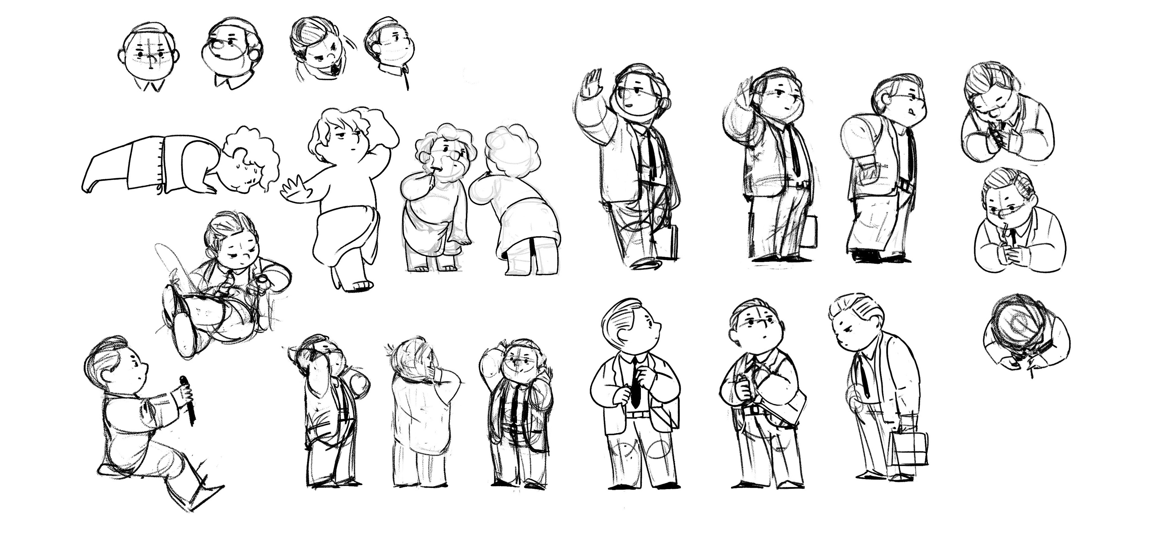
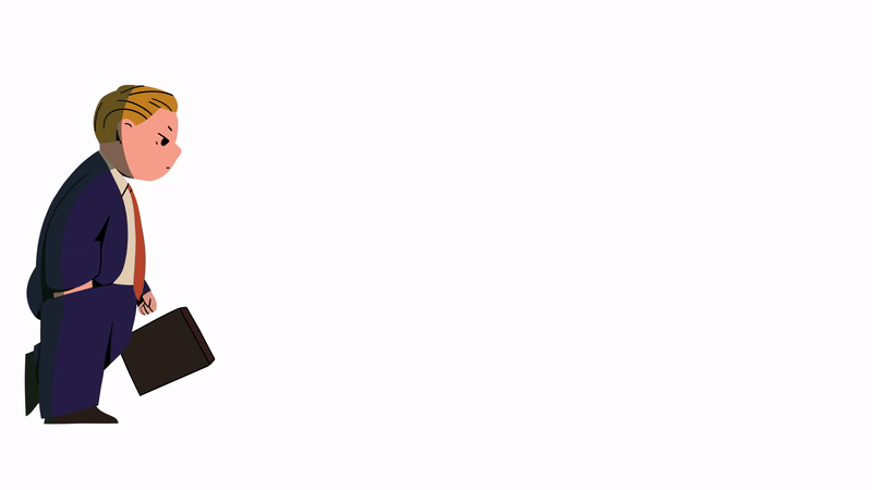
While my natural instinct in drawing characters gravitates more towards loose, sketchy lines (like ones above), I wanted to try a more vector-based character design. One strategic reason was that this design could allow me to get away with keyframing the character animation in AfterEffects for shots with simpler, repetitive movements (i.e. the walk cycle below).

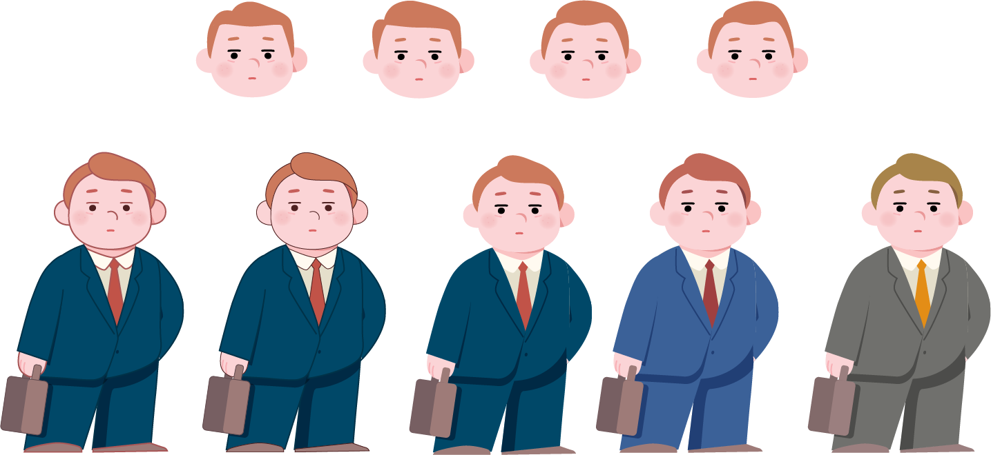
Eventually, as the rest of my film became more defined in its look & feel, such a vector-based design with razor-sharp clean lines felt too artificial for the story. Also, the way I wanted my characters to move in my film became more decidedly organic and realistic, which meant the number of shots I could get away with keyframing in AfterEffects became too small for me to justify the vector design.
However, I'm glad I explored this route just so that I could close this door with confidence.
However, I'm glad I explored this route just so that I could close this door with confidence.
FINAL DESIGN
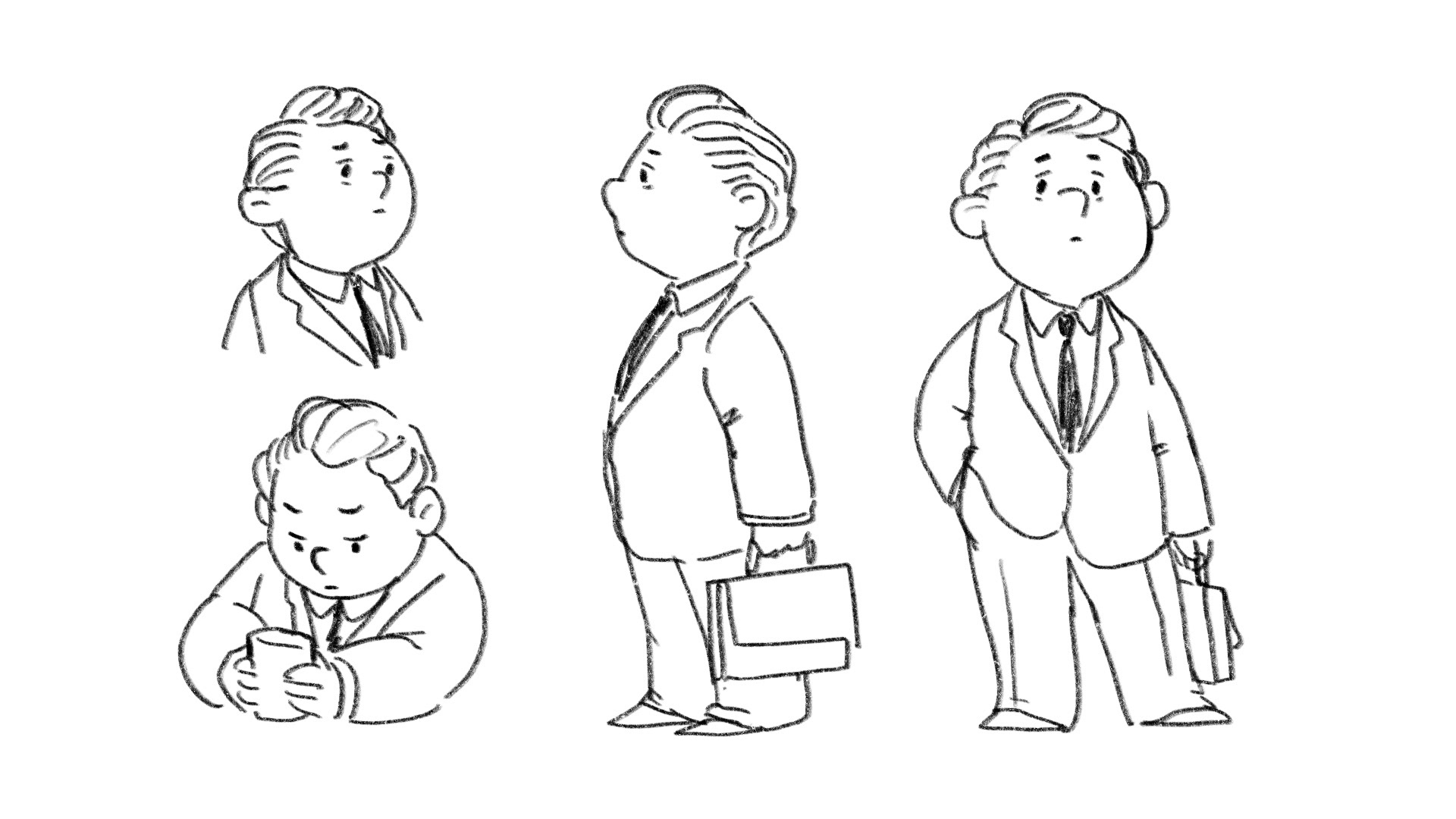
The early sketches in my character intro informed the general silhouette and volume of how the characters were going to look. As my story took more clear shape, I was able to make more purposeful sketches testing specific poses and emotions the characters were going to have. Below are the more defining sketches that helped me discover the final design for my characters.
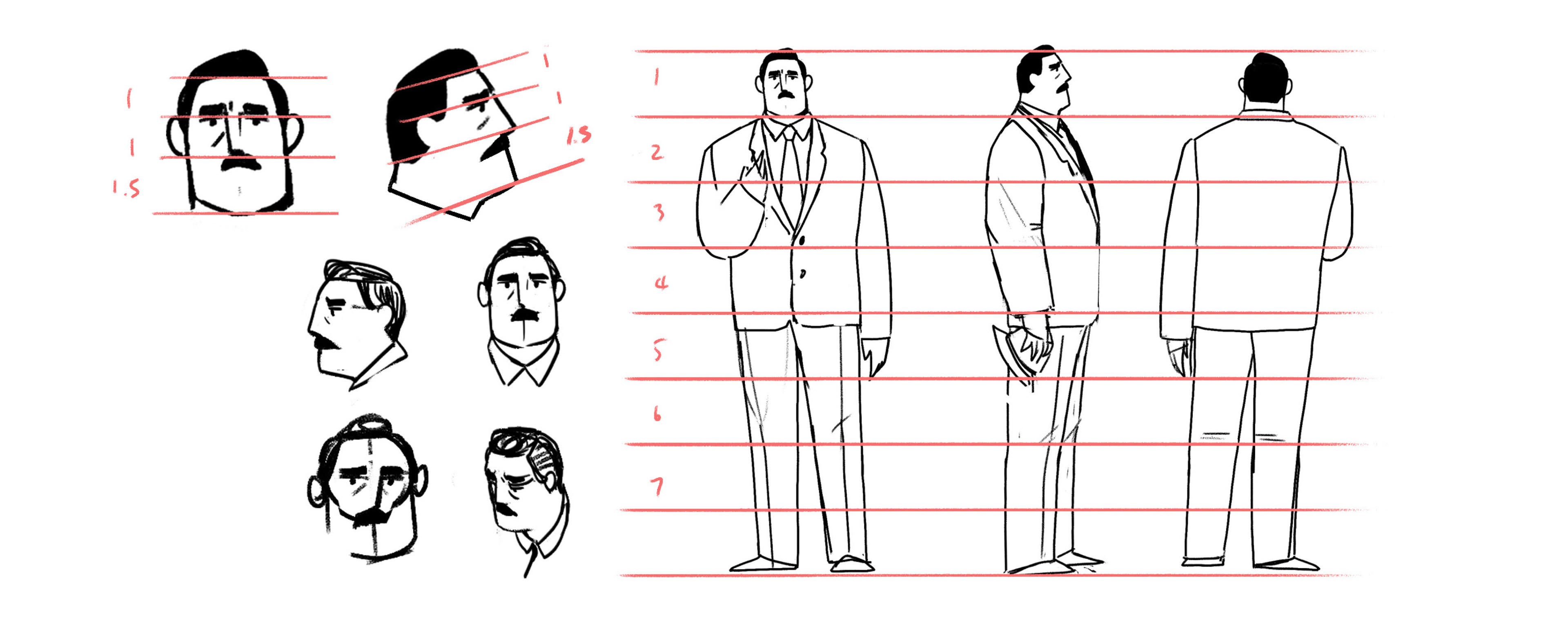
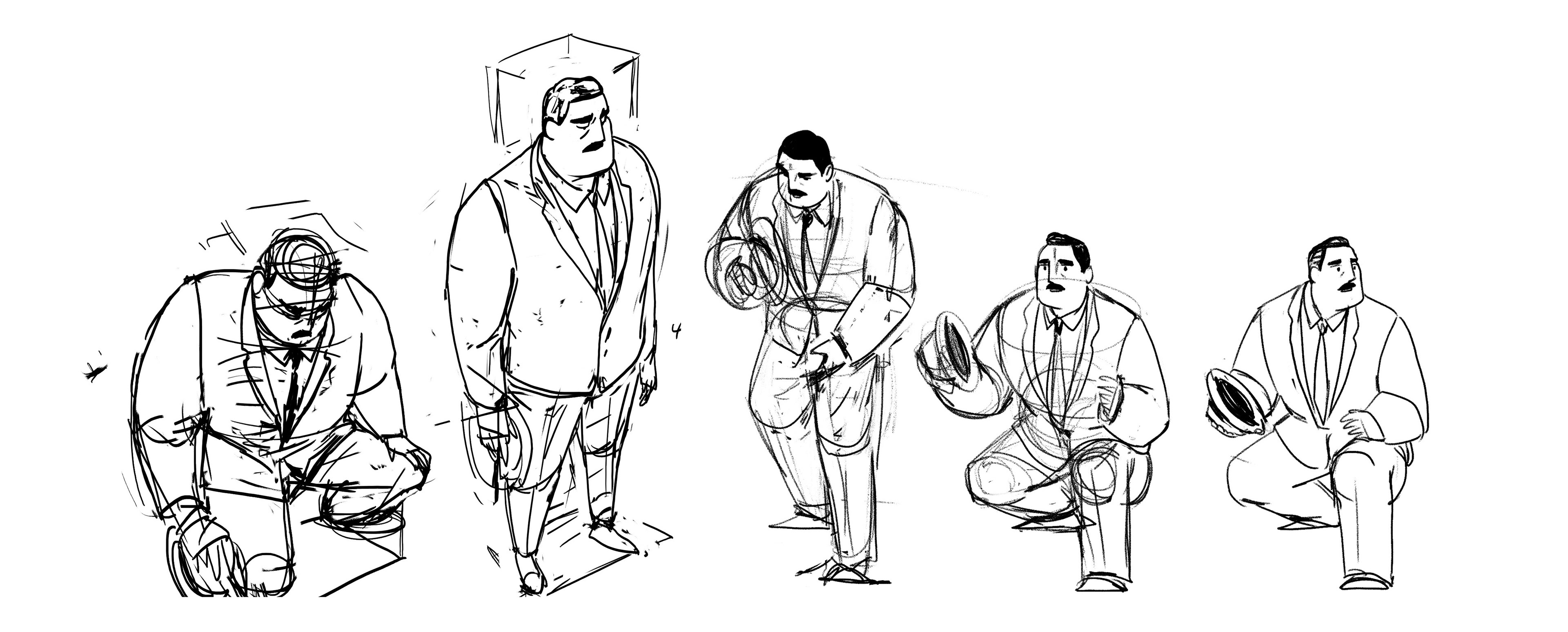
I was able to establish a final design only after I tested out an attainable workflow. While my earlier vector shape design felt too clean, I didn't want to find myself with a design so complex that it would take me a full week to finish one shot. Also, one of my biggest dilemmas was whether or not I was going to make my characters outlined. All of these small and big decisions came only after testing out a shot from start to finish.
The design for older versions of Nick and Frank came pretty naturally after their younger selves. To remove any possible confusion about the younger and older version being the same person, I matched the color palette of the younger version's wardrobe with that of the older. I wanted Adult Nick to be as tall and mature in size as young Frank to hint at Nick's inherited qualities as Frank's son, all the while visually representing the reversal of their power dynamic.