Executing a one-man film production is like plate-spinning in a nutshell. You have to start one process and bring it to momentum, while simultaneously starting the next process and also bringing it up to speed. By version #4 of the animatic, for shots I knew were going to end up in the final version, I kicked off my visual development.
BEATBOARDS
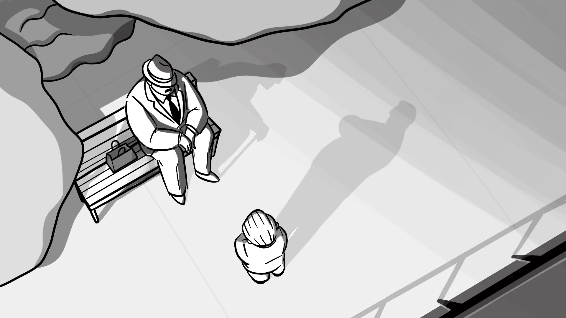
Sitting somewhere between a storyboard and a styleframe, a beatboard is essentially a more realized storyboard made for major story beats. While this process could feel redundant as drawing an incrementally fancier storyboard, as someone who always struggles with colorizing my illustrations, making these beatboards was an important exercise for me to understand the value relationship within each composition.

COLORSCRIPT
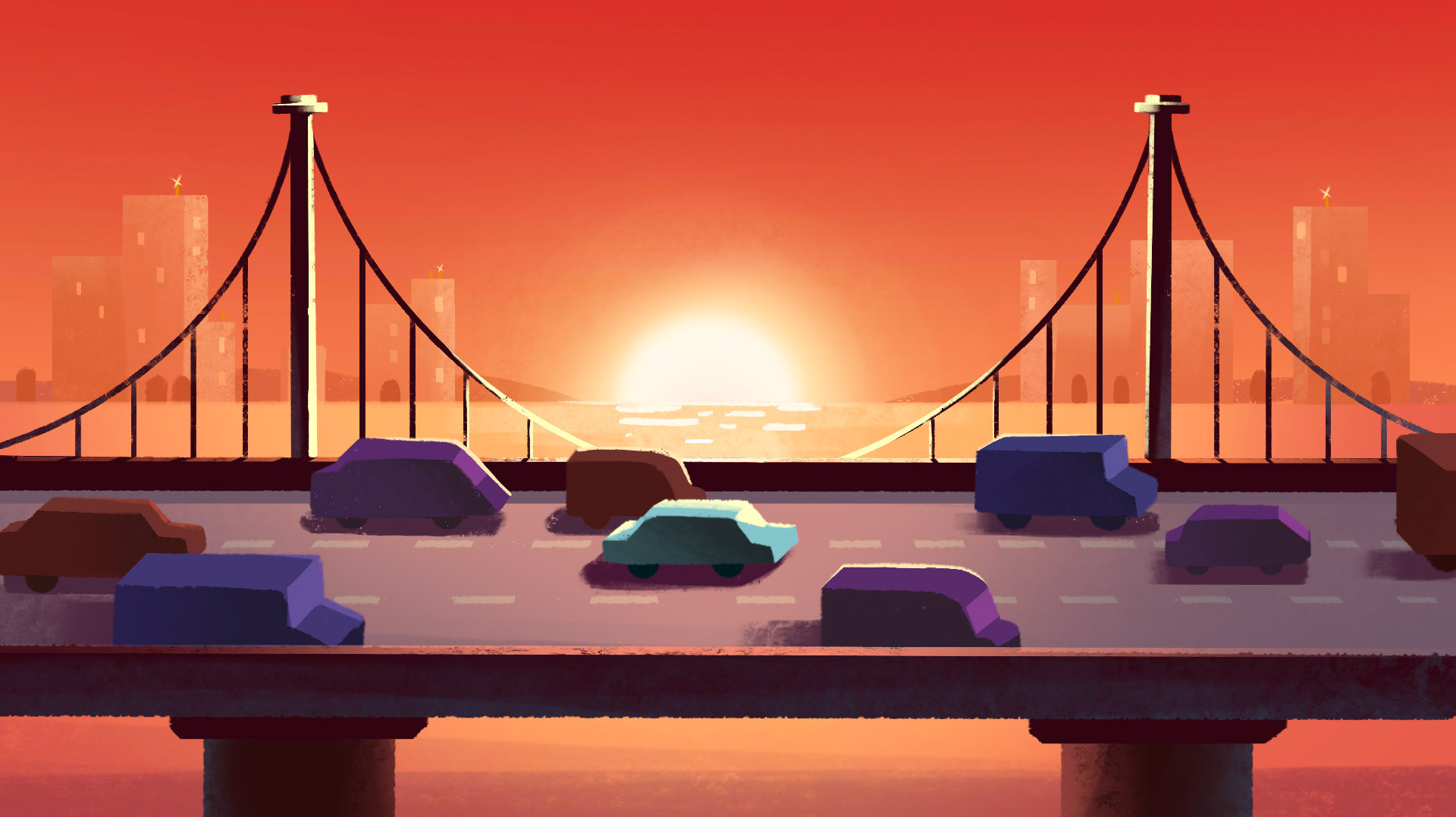
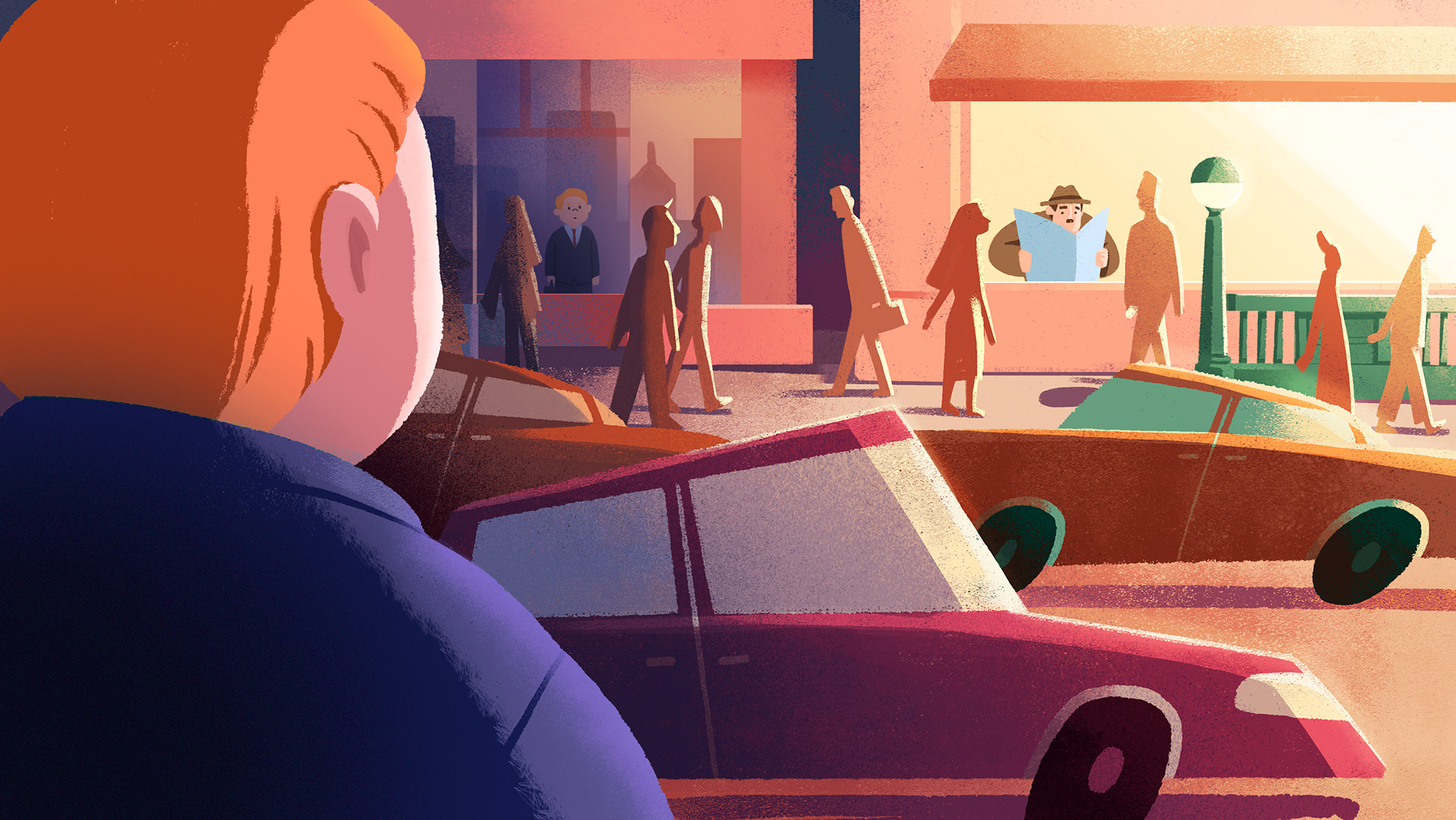
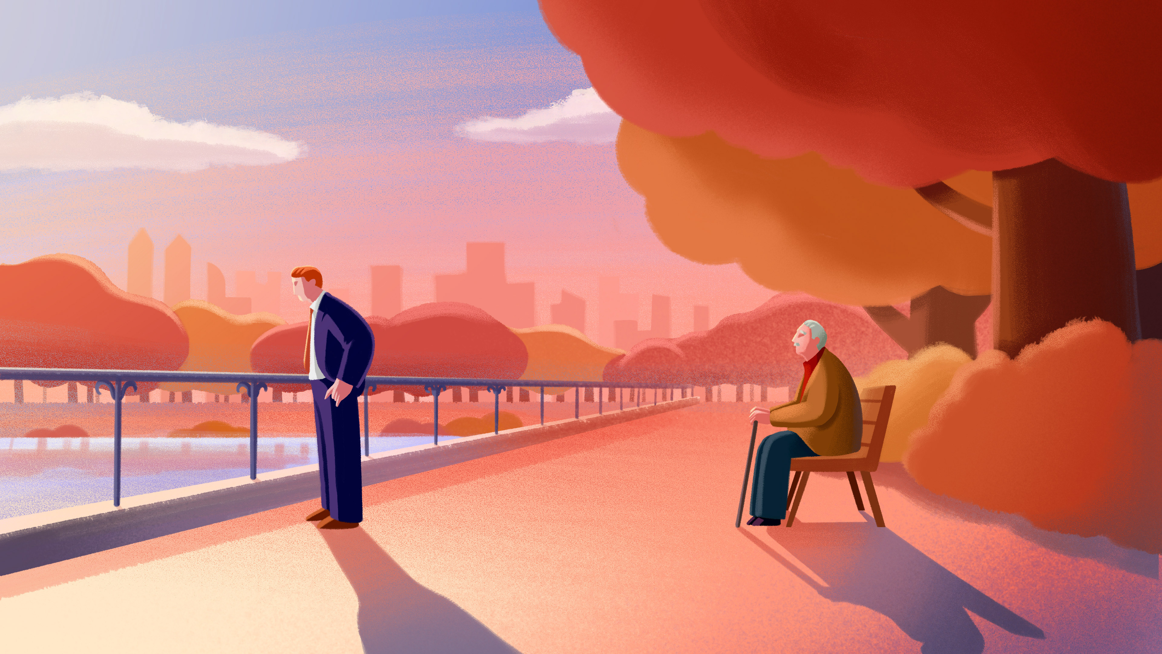
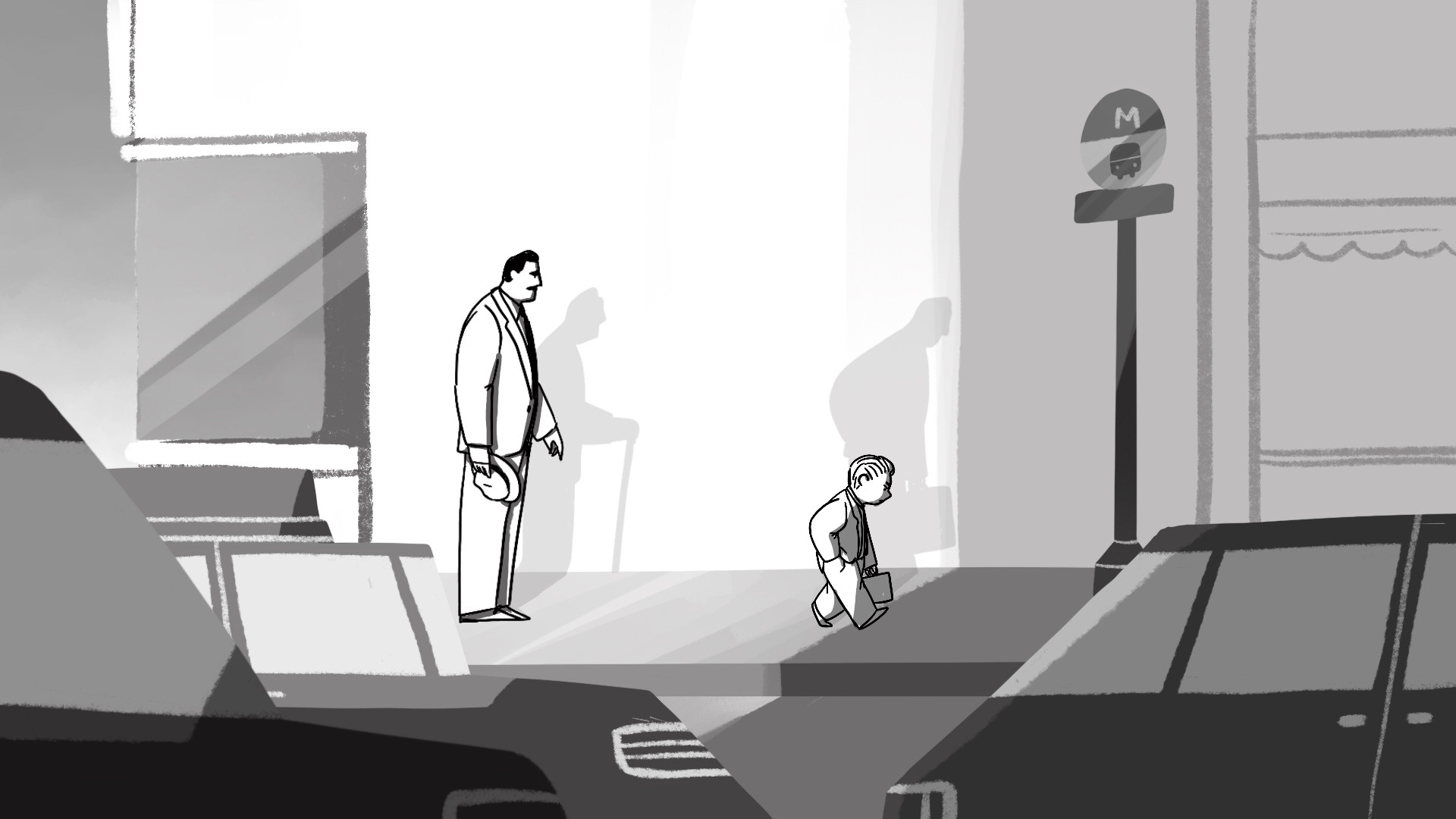
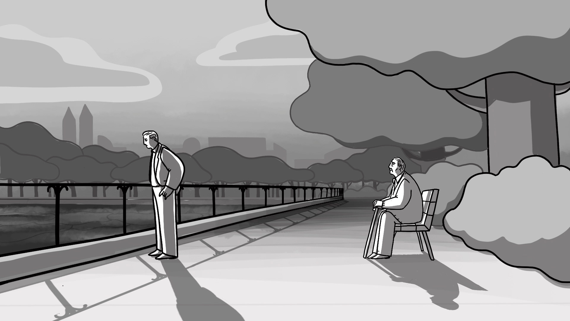
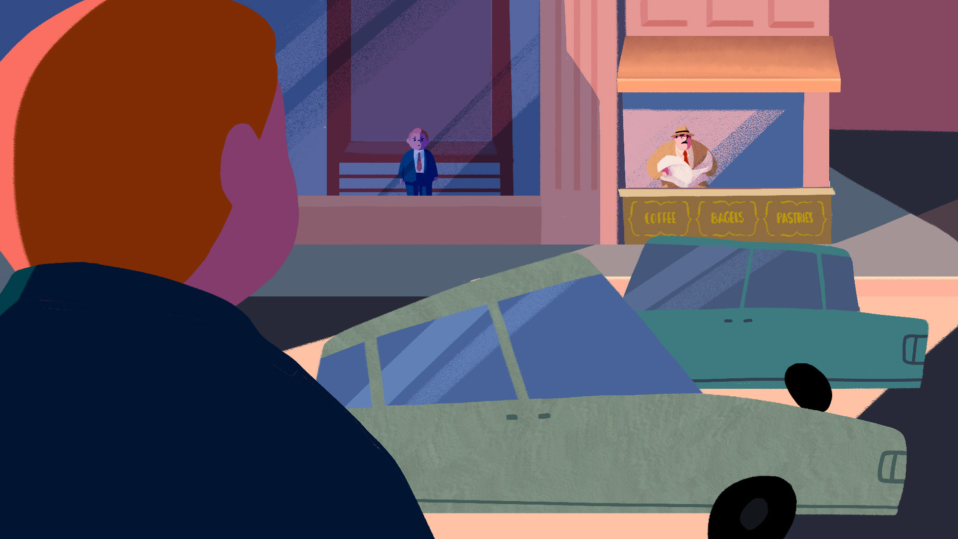
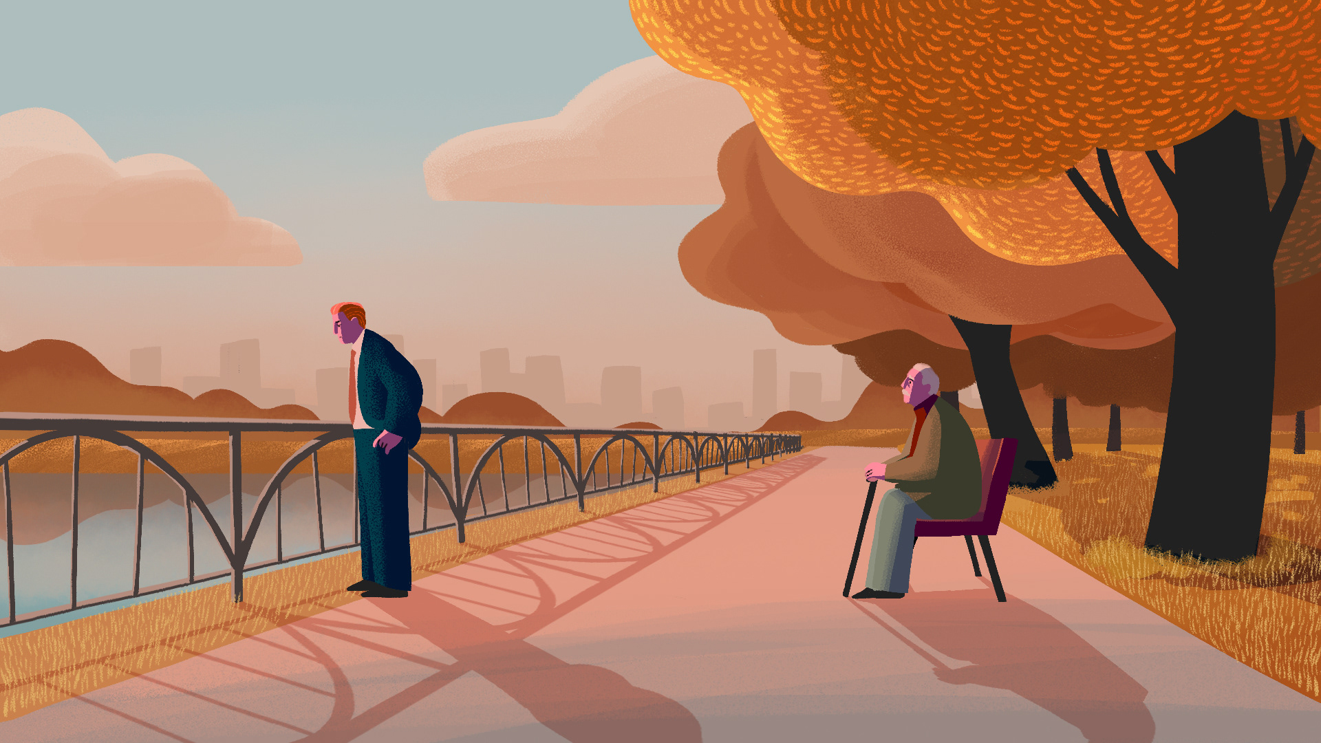
Once I got the broad strokes of how the scenes were going to be structured, I made a color script, assigning a unique color palette to each scene. The shift in color palette from scene to scene parallels Nick's evolving emotions throughout the film. For example, when Nick and Frank have their first encounter, Nick’s resentful and accusatory attitude toward his dad is heightened by the harsh golden hour light that creates sharp, dramatic shadows. Just as the intensity of Nick’s emotions overwhelms him, the hyperbolic saturation of the colors makes the entire scene feel particularly graphic and expressive. Meanwhile, in the final scene when Nick finally opens up enough to even converse with Frank, his emotions are real, yet contained and composed. The lingering pink glow before sunset sets a somber tone as Nick and Frank have a raw conversation. The colors and textures in this scene feel natural and grounded in reality.

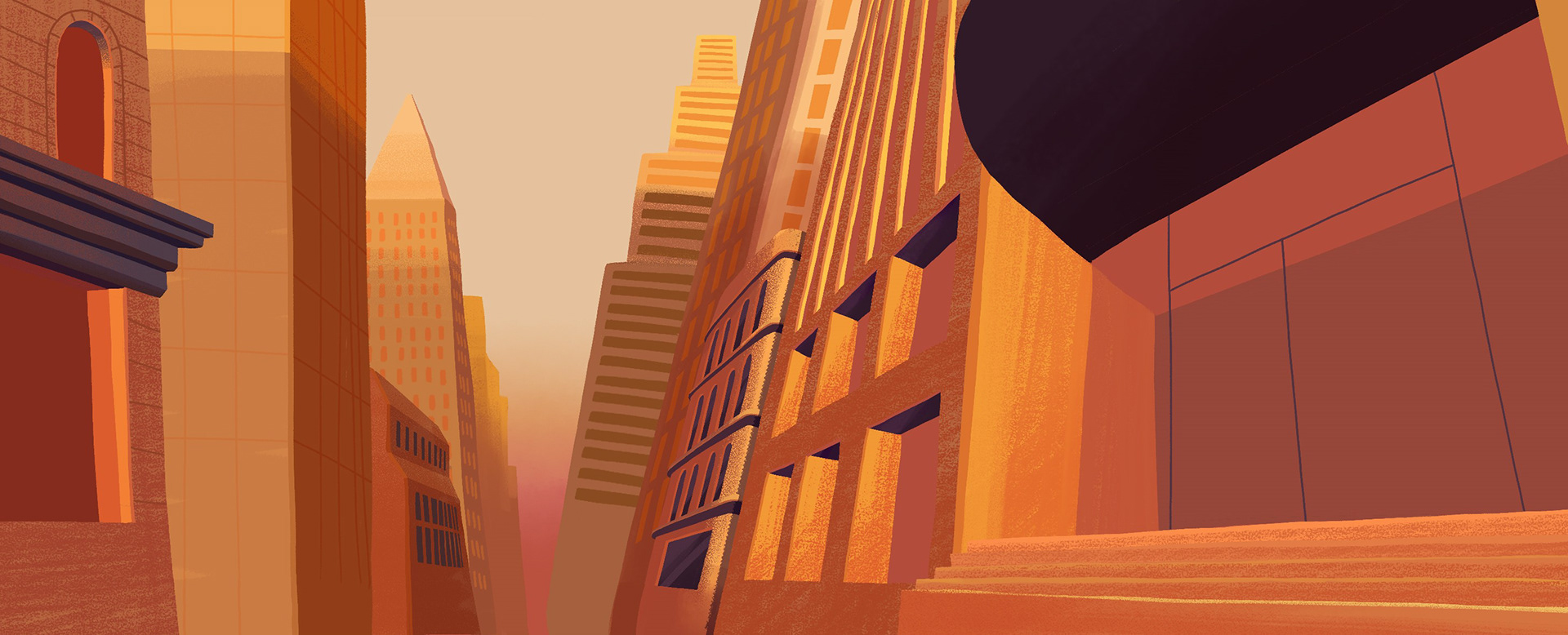
Based on the key colors defined by the color script, I moved on to creating styleframes to granularly explore how the final animation would look and feel. This is where I started thinking about the options of incorporating 3D elements in the workflow to magnify a sense of depth as well as accurately portray perspectives in shots that have more extreme camera angles and movements.
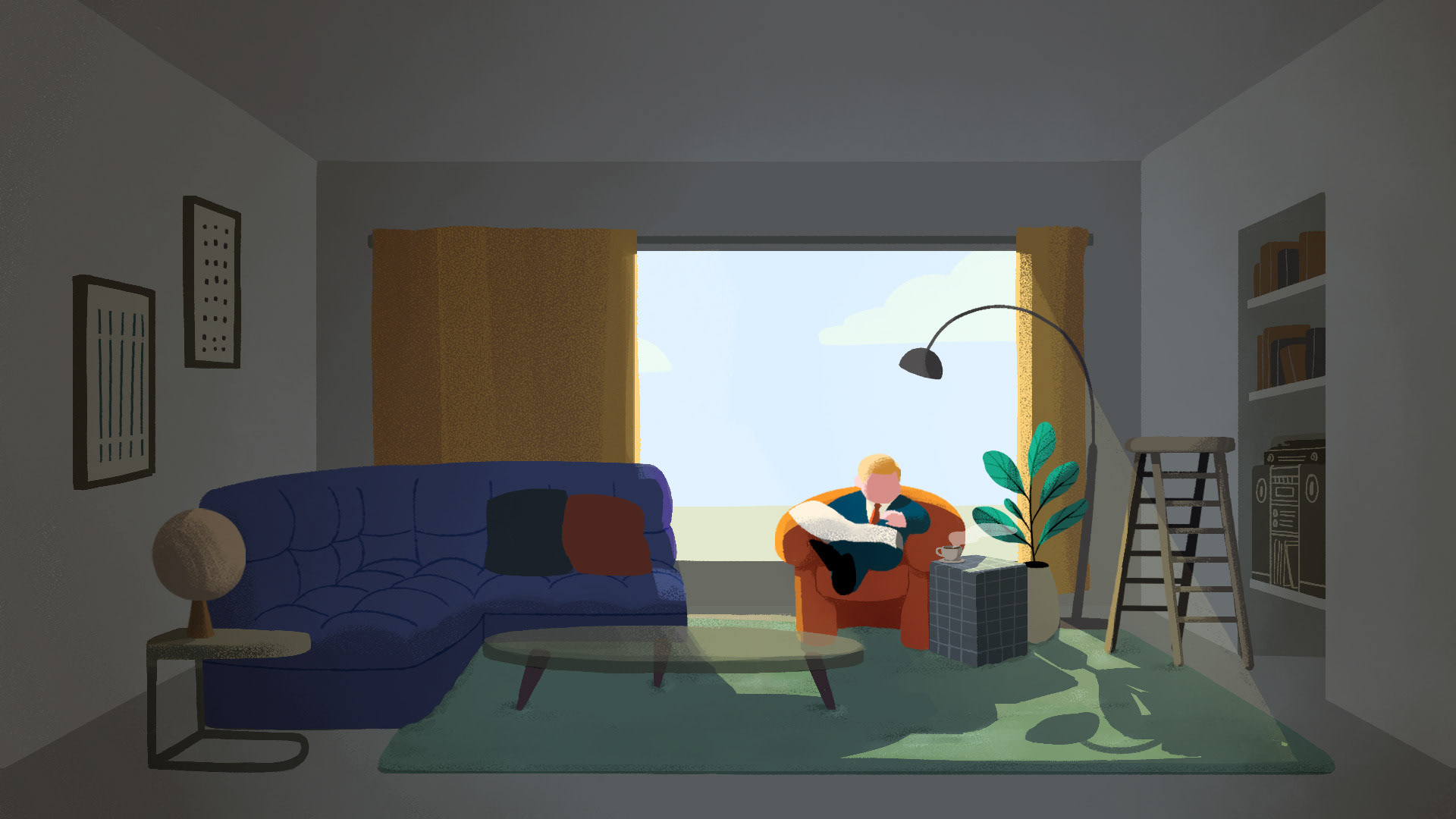
Based on these style frames, I made my first attempt at a background art I could use in the actual production. I paid attention to the lighting treatment as well as the kind of brushes/ textures I would use for the background, making sure the density of detail was something I can manage for the rest of the film. While I initially liked how graphic this iteration looked, I later felt this exact abstracted nature limited the depth of emotions that could otherwise be felt in a more realistic lighting.
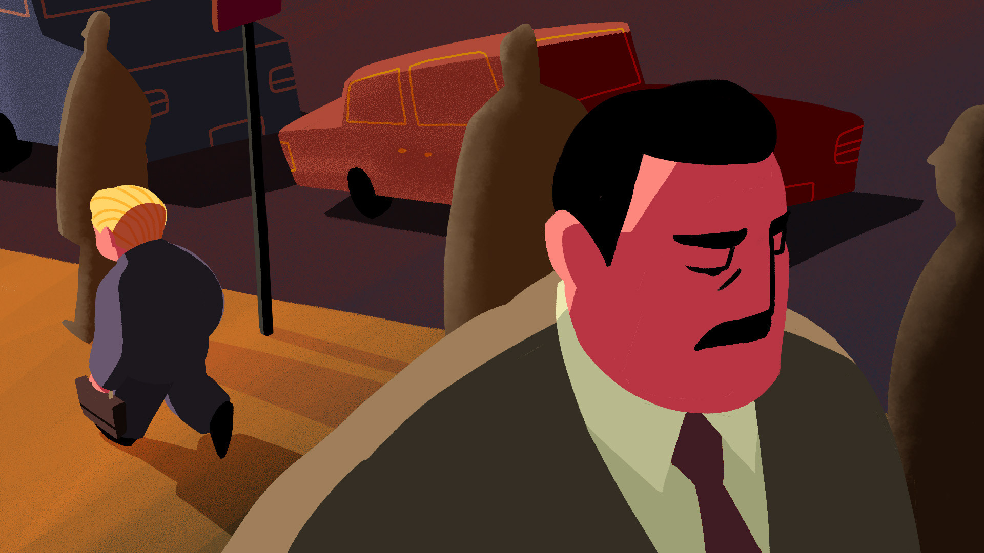
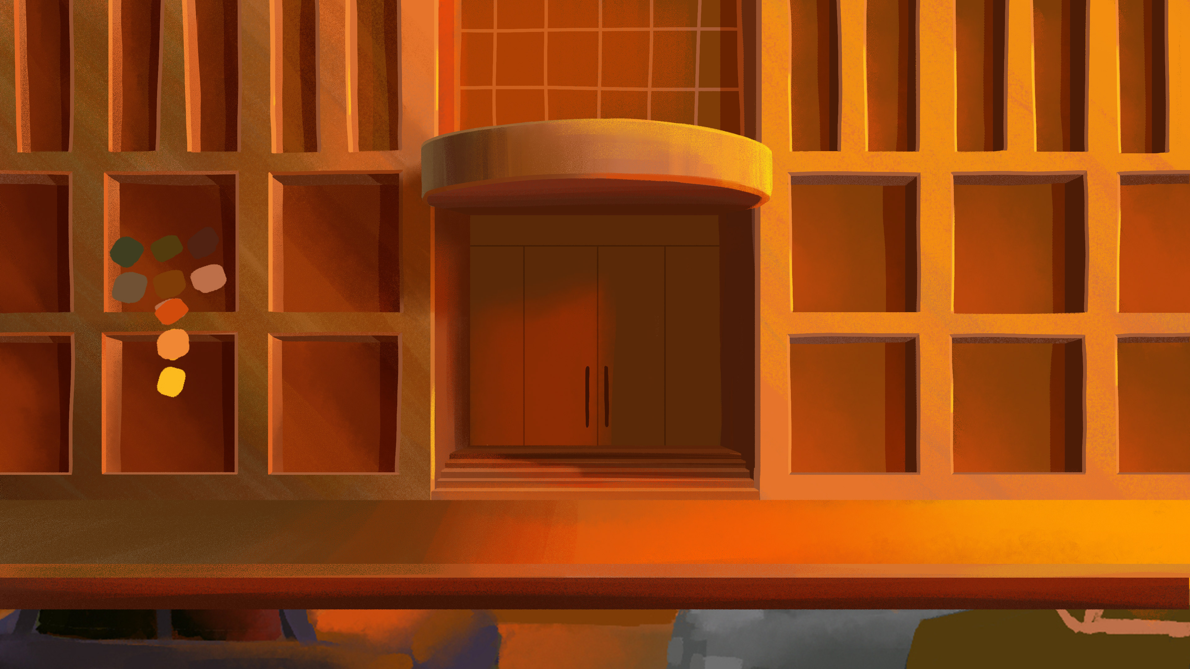
Also, I didn’t realize how lacking I was in color theory until I started iterating on my backgrounds. In making my colorscript, I knew I wanted my second scene when Nick first encounter Frank to be heavy in orange hue - the kind of intensity only the golden hour offers, but with a shade that’s thick in resentment. My first attempt at drawing the backgrounds for this scene was met with rather lackluster results, ones that were so literally orange they lacked any meaningful depth or complexity.
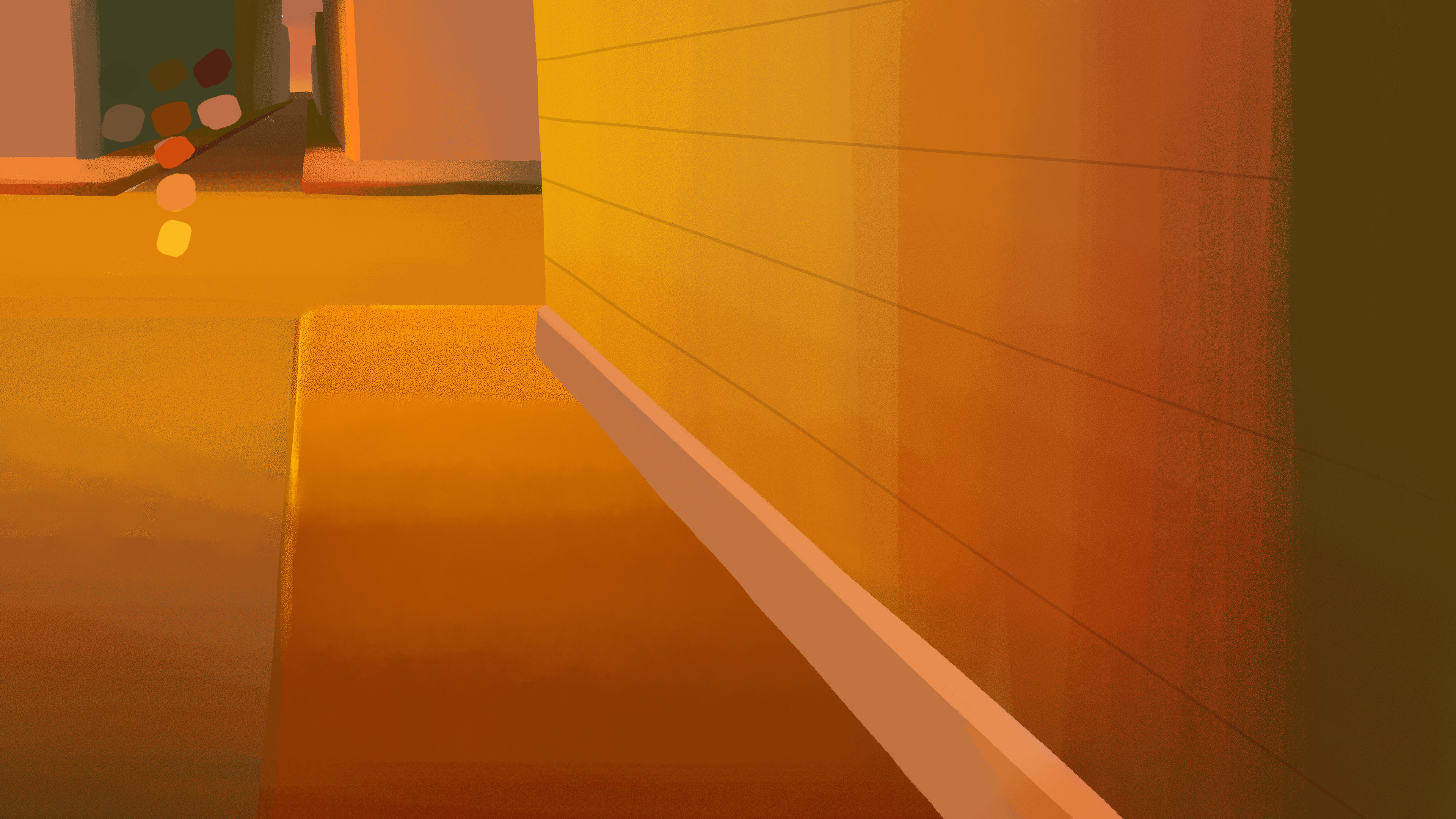
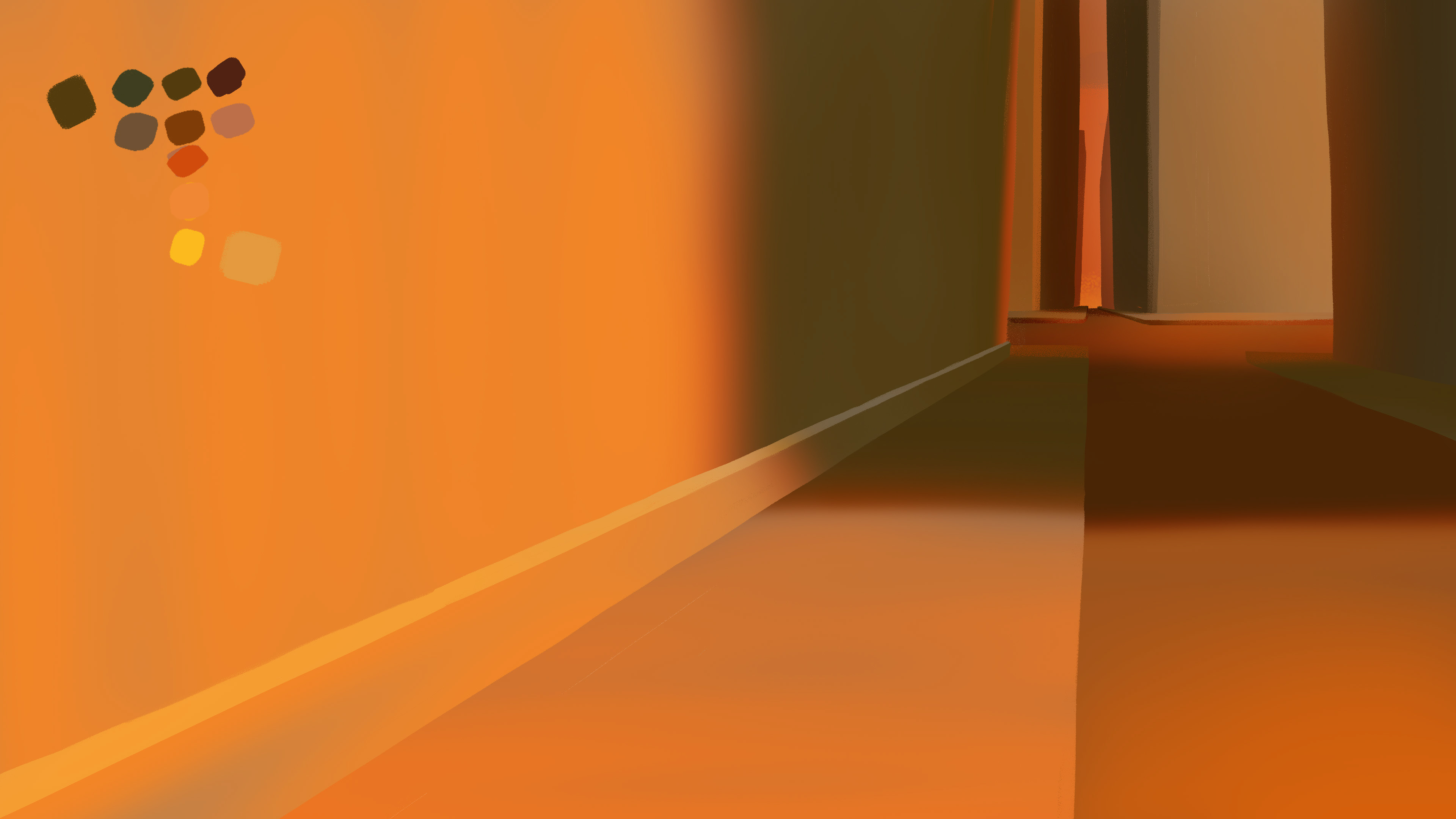
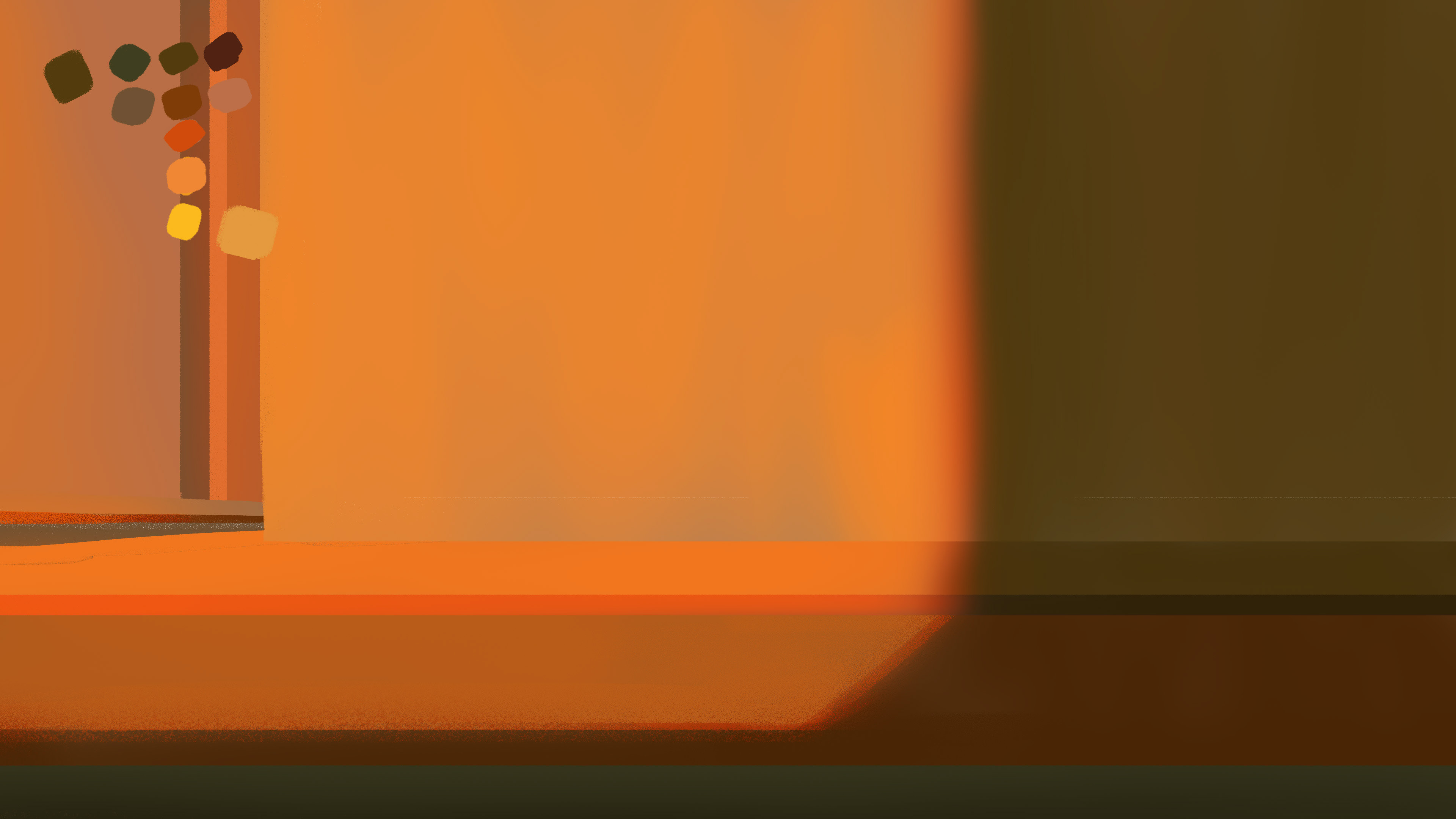
I spent my entire winter break (late December to early January) watching YouTube videos on color theory and repeatedly testing and failing to land on a background color treatment I like. At the same time, I was also getting increasingly anxious about not having already started my character animation. However, I felt this trial and error was a necessary process I could not skip. So, I decided to get help.
Sein Jin, whom I worked with during my short stint at an animation studio in Korea, is a super talent who has a keen eye for colors. I brought her on to test out color treatments for three pivotal shots. She banged out these beautiful styleframes for me, which ultimately informed my approach to the final background art.